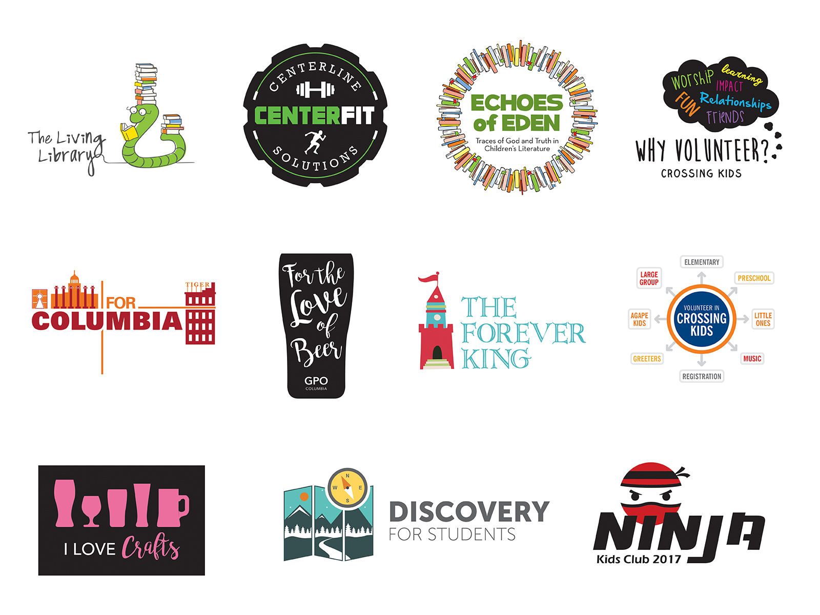
Logo Design
Client: Various

I have created several logo designs over the last few years. My logo design strategy is to always:
- Sketch ideas on paper before moving to digital. This helps unload and evaluate ideas quickly and more freely before getting wrapped up in digital contraints.
- Keep elements and text simple and clear. This improves logo scalability and legibility at any size.
- Design in black and white first. Clients commonly need to print without color or use a reversed out logo on top of dark backgrounds. This requires a logo that is clear and effective in black and white. Color should only be added with specific purpose.
- Use as few colors as possible. For print projects where spot colors are required, every additional color increases the cost. This is something clients might not be aware of.
- Keep the design as minimalistic as possible. This helps create a design that feels uncluttered and is easily recognizable at a glance.