Case Study: Green Bites
Healthy meals can be fast and easy!
Overview
Parents want their kids to eat nutritious foods, but plant-based recipes often feel unfamiliar and time-consuming to make. Work stress and school activities also make it difficult to devote time in the kitchen when less healthy options are quick and readily available. Parents need healthy, kid-friendly meal options that are fast and easy to cook at home, even on a crazy school night.
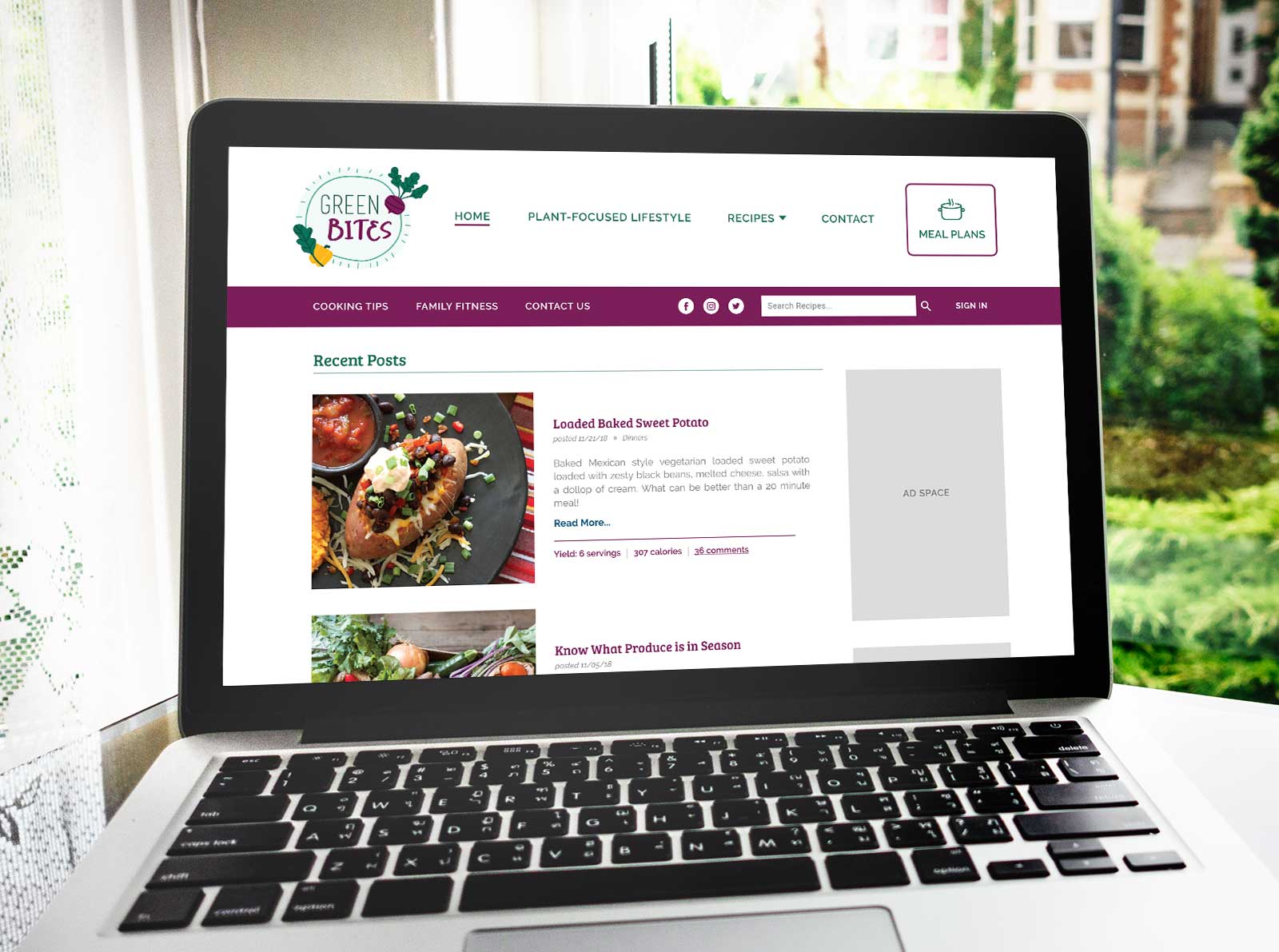
Green Bites is a web-based recipe library and meal planning tool for families who want to eat more nutritious foods without sacrificing time or flavor. Its uncomplicated recipes take less than 30 minutes from start to finish and include instructions for make-ahead meal prep, freezing, and ingredient substitutions. Its interactive meal planning tool allows users to create weekly meal plans and compiles a grocery list to save users time.
Timeline: 4 weeks
My role: Executing all stages of the project including user research, problem definition, ideation, design and prototype creation, and user testing.
Out of scope: Account setup, save/store meal plans, grocery list export, final development
Process
Empathy & Research
I began the project by conducting user interviews. I wanted to learn what affects people’s decisions around daily food choices. I targeted 25-35 year old people because they have limited free time and experience high stress from career and family commitments.
My interviews taught me that parents experience more negative emotions in trying to choose healthier food options than kid-free adults. Contributing factors commonly included:
- Parents tend to be more mentally and physically tired each day.
- Parents are concerned about the quality of foods they consume because they feed it to their kids.
- Many parents didn’t grow up with healthy food choices (or a good role model for healthy eating) so there is a lack of knowledge/misconceptions around what to choose or how to prepare/cook.
To synthesize my interview data I created an empathy map. This helped me sort my data and see what tangible problems could actually be addressed. I found several points of conflict between what the interviewees were saying versus their actions.
I also chose to utilize an affinity diagram to further synthesize the data. I needed to see if any patterns or themes were common amongst the interviewees. Some key concerns they had in common:
- Wanting healthy recipes that require limited time to prepare.
- Wanting education on what “healthy” looks like.
- Wanting to enjoy cooking and getting the family to participate so it is a team effort.
- Wanting flexible options because daily schedules can be unpredictable.
Definition
I created a user persona to define a clear representation of my target user based on my research data and user concerns.
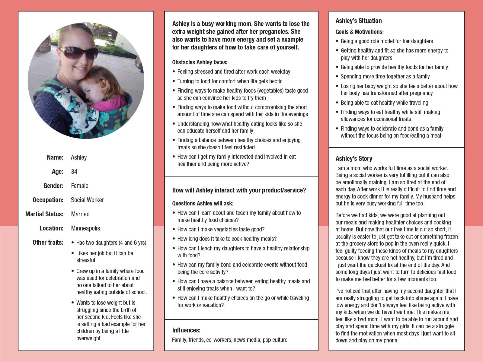
Ashley is a busy mom who is affected by:
- feeling tired/stressed most days
- wanting to set a healthy example for her kids
- wanting to have a balance between healthy foods and treats (she doesn’t want her kids labeling food as "good" vs "bad")
- wanting to spend her free time with her family
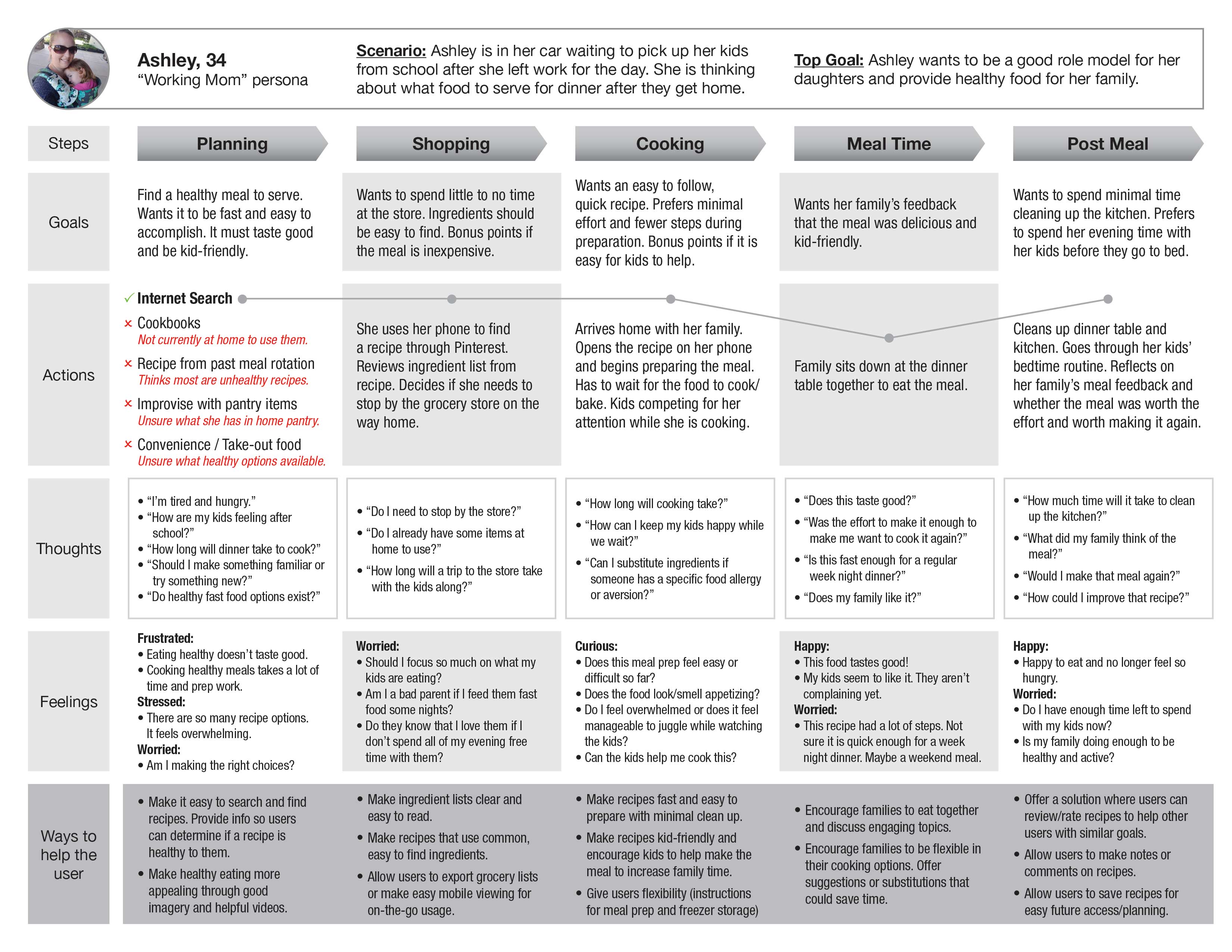
I created Ashley's customer journey map to empathize with what she thinks, feels, and struggles with while trying to plan a family meal. I found that:
- She struggles to find extra time in her day for pre-planning. Tasks are frequently done on the go.
- She is drawn to options that require less time/effort.
- Searching for a recipe online feels overwhelming to her. Many top search results take her to a list of recipes that she has to search through again.
- Every recipe blog has a different layout so it can be difficult to locate nutrition information and other vital data to determine if a recipe fits her family’s preferences.
- It is common for recipe blogs to include lengthy stories and advertisements at the top of a recipe page. This makes it difficult to quickly scroll down to locate the actual recipe details.
My problem statement began to form – “How might we educate users on healthy nutrition options (user action) so they feel more capable of providing nutritious, good tasting foods to their families (user benefit)?” The solution’s goal would be: “To educate families about balanced nutrition and demonstrate that healthier meals can be delicious and quick to make at home.” This gave me criteria to brainstorm and evaluate possible design solutions against.
Ideation
I took the key insights from the persona and journey map analysis and formed several “How Might We” questions. I then did Brain Dump sessions for each question to quickly brainstorm through ideas. I narrowed my ideas down to a few unique options:
- Pantry/Fridge Inventory App
- Plant-Based Recipe Library
- Interactive Meal Planning Tool
- Local Grocery Meal Kit Service
- Diet/Exercise Education Tool for Kids
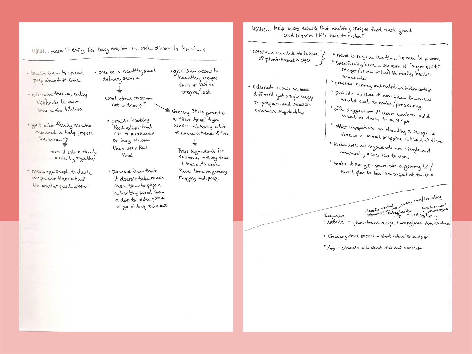
When evaluating my ideas, I considered what would benefit Ashley the most with her specific concerns – a) nutrition education, b) time-saving recipes to choose from, c) flexible options for healthy meals on extra busy days, and d) resources/info on how to involve kids/spouse to make a meal (or other healthy activity).
This led me to decide that a responsive website that included the plant-based recipe library and interactive meal planning tool would be the best option.
I performed some task flow analyses to determine what tasks a user would expect the website to help them accomplish. Determining primary versus secondary tasks helped me to form the website’s navigation and layout hierarchy.
Prototype & Evaluation
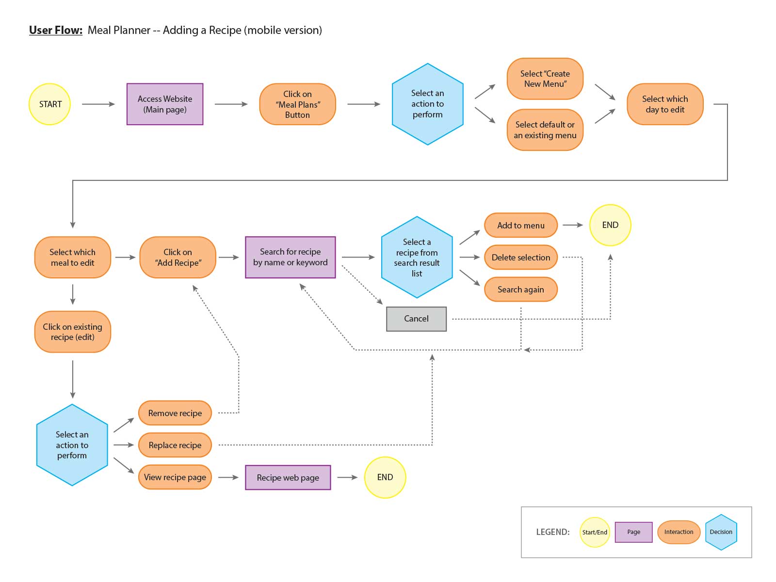
Once hierarchy decisions were made, I performed user flows to examine how a user would approach using the website to accomplish tasks. This determined what web pages needed to be designed.
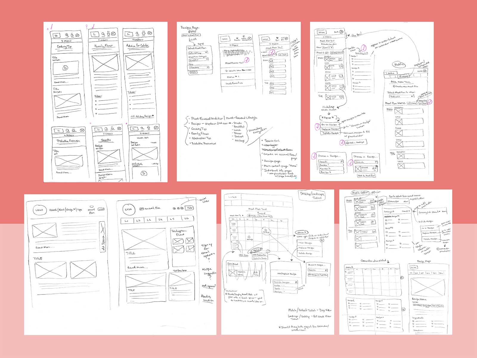
Using a mobile-first approach, I sketched mobile layout pages on paper. I wanted to quickly express and iterate through these early design options before investing time and effort on digital mock-ups.
Using the most user-intuitive pieces from the rough sketches, I created low-fidelity wireframes using Figma. This gave me a digital skeleton that could be tested for viability and interaction issues as early as possible.
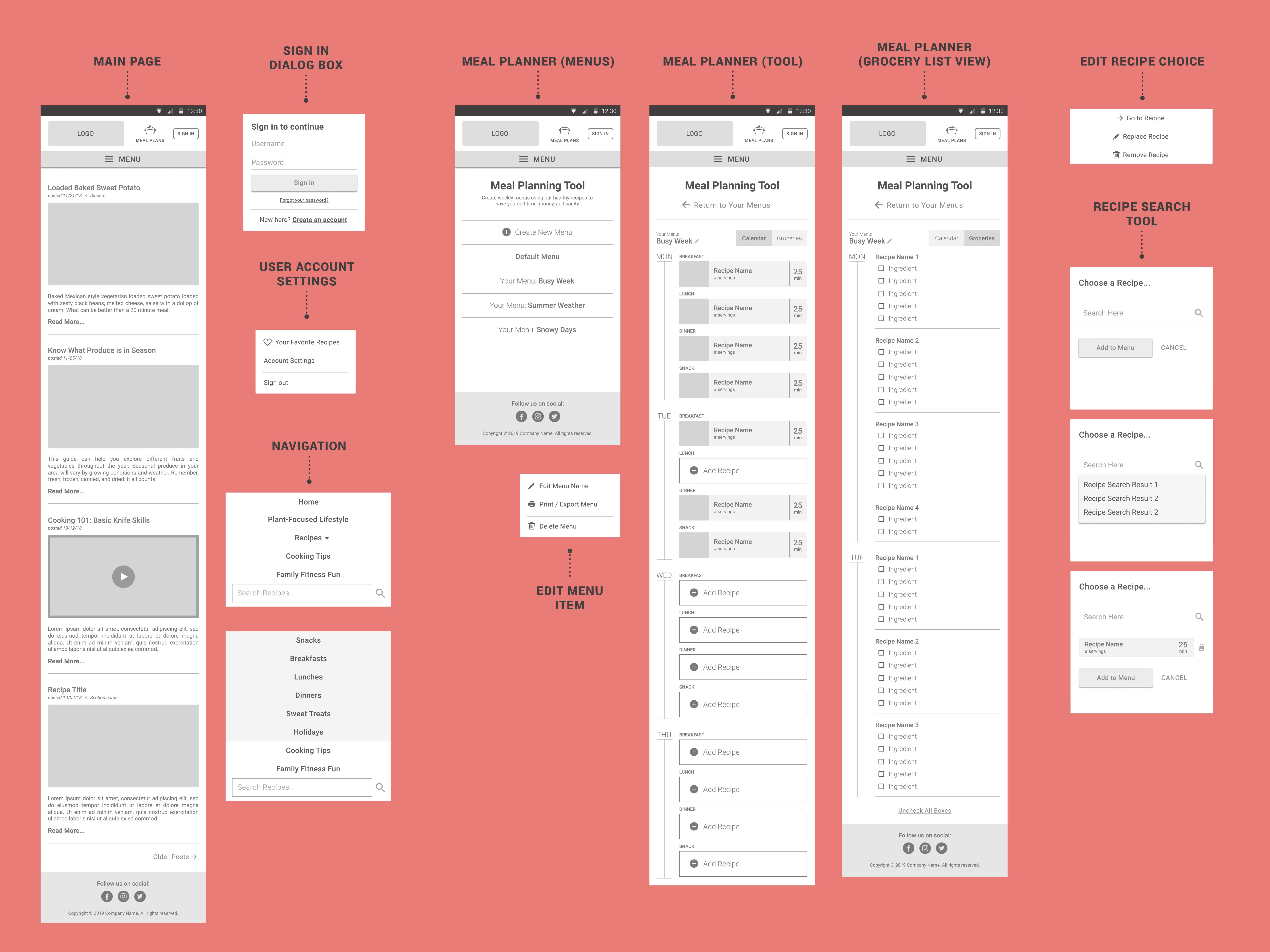
I conducted a usability test on my low-fidelity wireframes with two target users. This uncovered minor visual issues that needed to be adjusted. I also worked with test users to determine the most valuable “at a glance” information needed to decide if a recipe was worth clicking on. Top key info included: meal/product photo, time required (prep + cook together), and serving size.
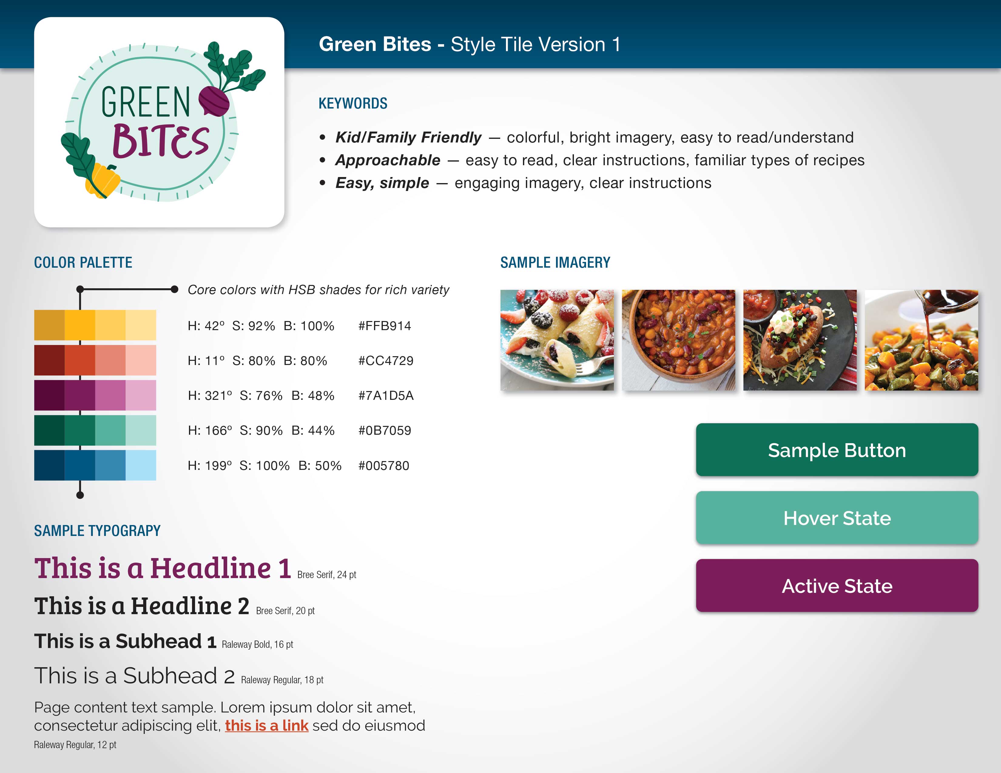
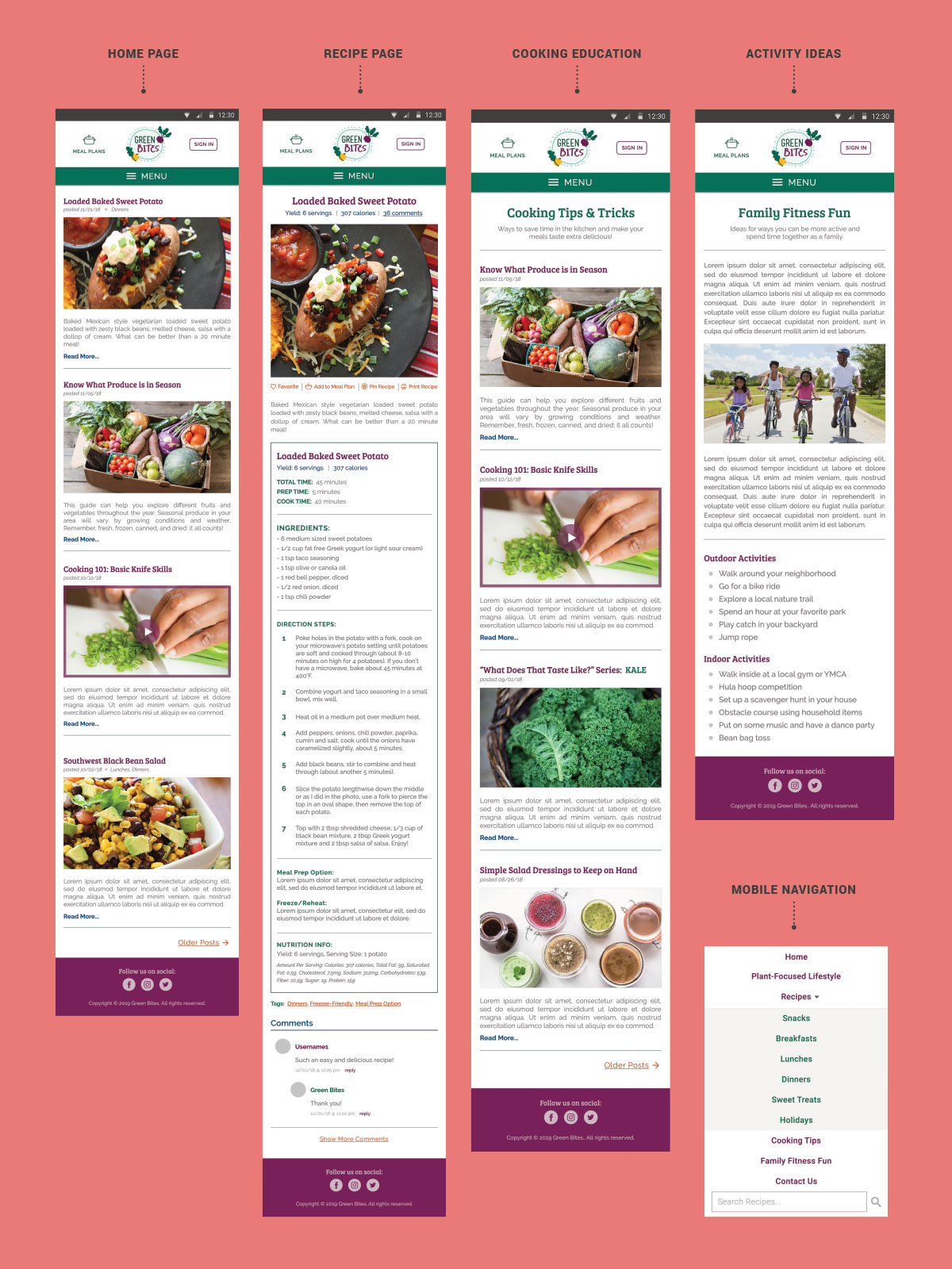
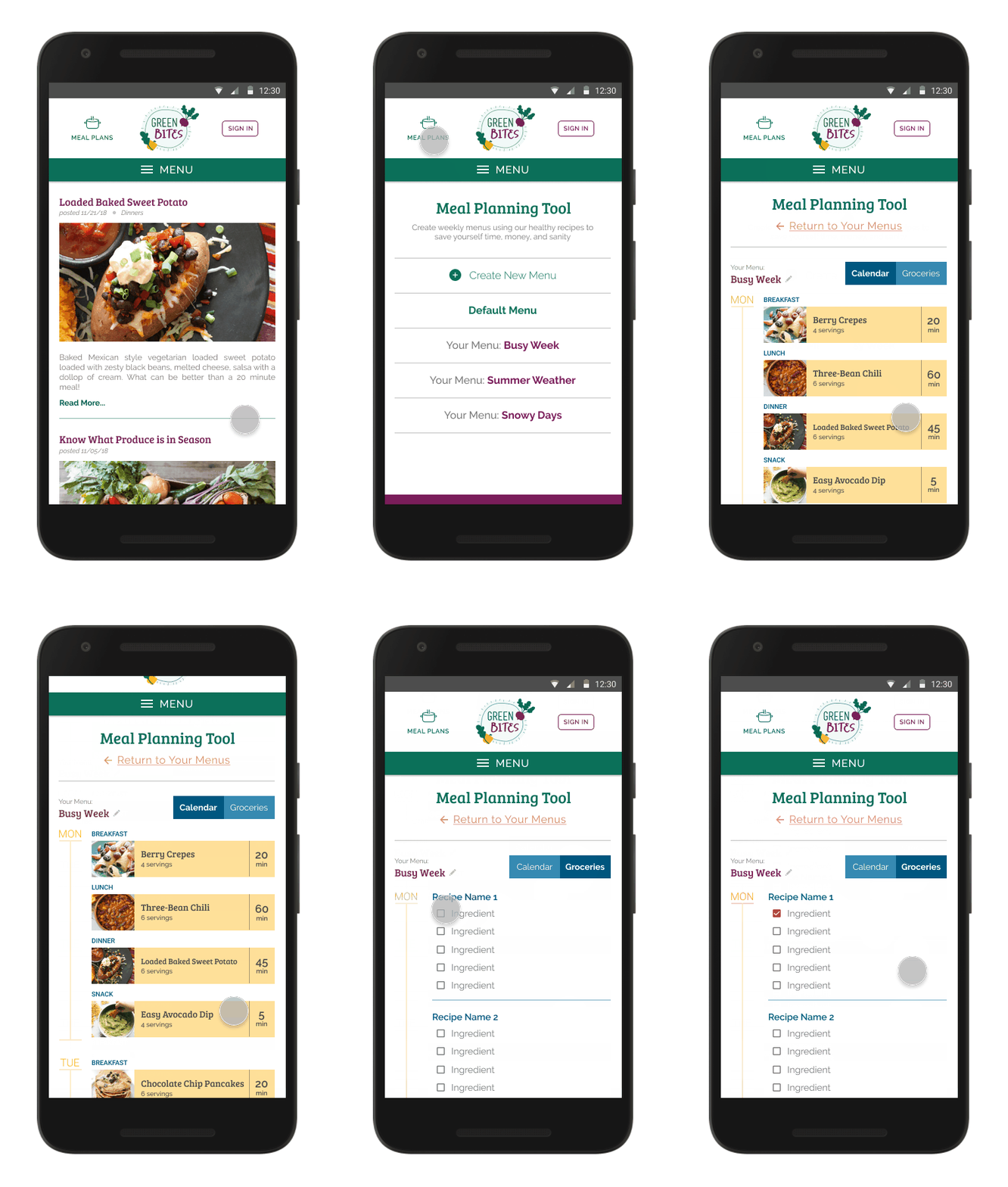
After testing, I moved on to visual design. I created a visual style tile to represent the brand’s look and feel so I could translate it to the web design components. Then I created the polished high-fidelity mock-up that would be ready for final approval and development.
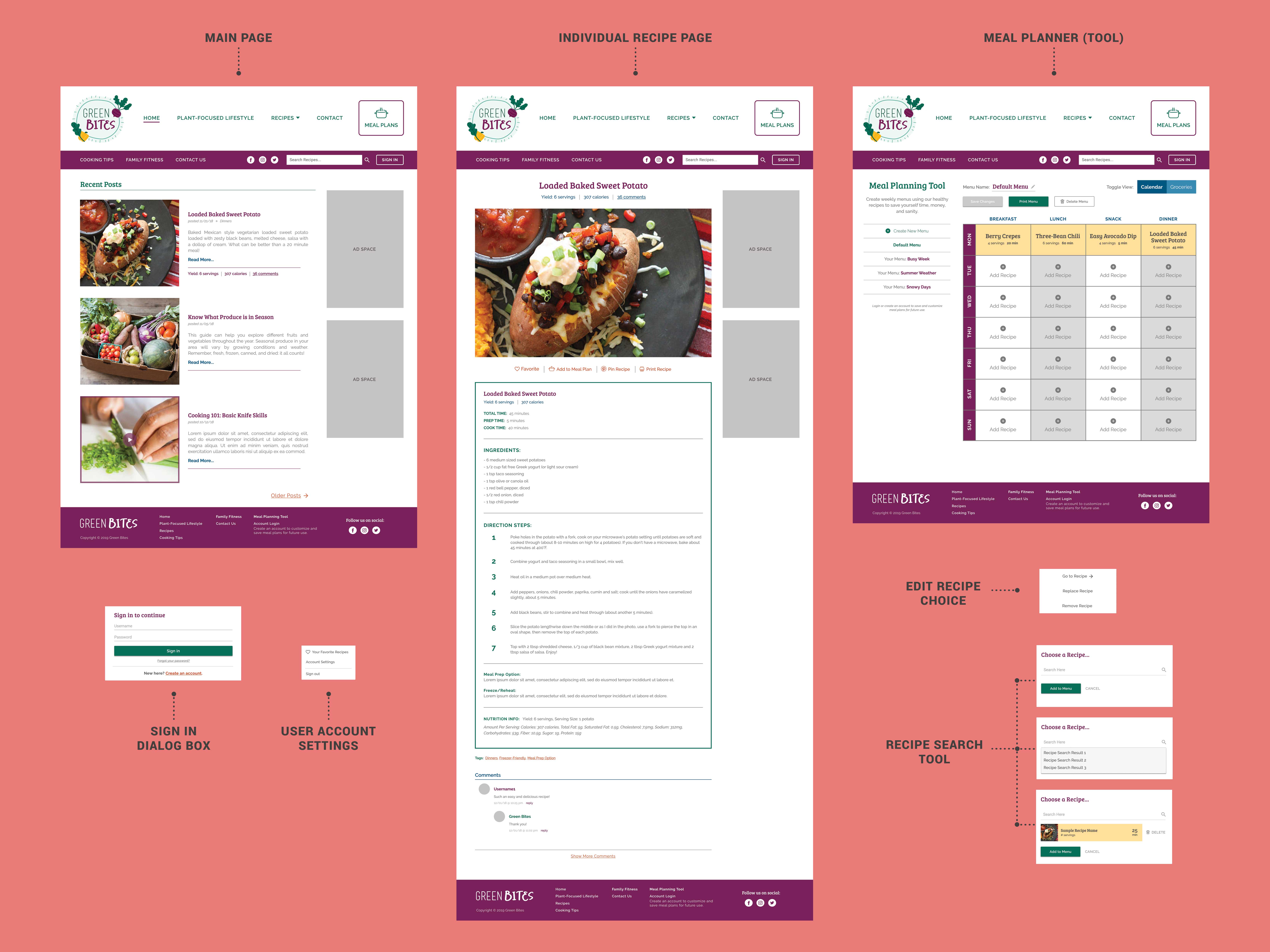
I also created a mock-up of the final desktop layout. This would help developers visualize how the responsive layout would change from mobile to desktop screen sizes.
Conclusion
Summary
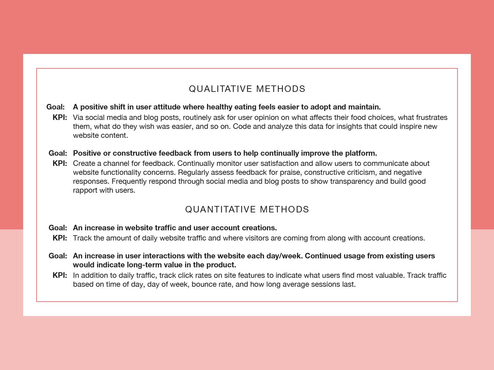
Green Bites is a responsive website prototype aimed at providing time-saving resources to busy people who want to eat healthier. I designed it as part of my self-driven Interaction Design Foundation course work. There are no current plans for development. However, if developed, I would track the following Key Performance Indicators to measure the product’s success:
Reflections
If more time and budget were available for this project, it would have been useful to test the meal planning tool with a wider pool of users in real-world scenarios.
Looking back, I would also like to talk with more parent users to discover valuable content beyond healthy recipes. Besides time and energy, I see a benefit to exploring how other factors influence their food choices.