Case Study: DollarUp
Empowering users to take charge of their finances.
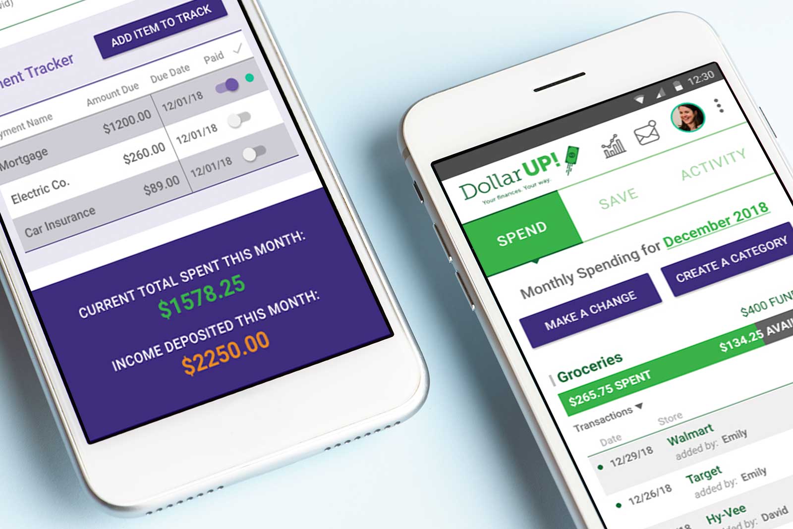
Overview
Managing your finances is a task that can easily ignite negative emotions and conflict, especially in personal relationships. Users of other financial apps find it difficult to customize features for their own specific budget goals and nearly impossible to utilize in tandem with a partner, leaving the burden on one person in the relationship.
DollarUp is a budget app aimed to empower users to reach their financial goals through the ability to create custom spending and saving budget categories along with a payment tracking tool to stay in financial control. The app also enables users to connect their account with a partner to effectively communicate and share individual data so both parties can contribute and work together.
Timeline: 4 weeks
My role: Executing all stages of the project including user research, problem definition, ideation, design and prototype creation, and user testing.
Out of scope: Account creation, account link setup, report generation, final development
Process
Empathy & Research
I began the project by conducting user interviews. I needed to understand what problems users were experiencing when managing their finances. I targeted 25-35 year old people as they typically have student loan debt. They are also embarking on plans for marriage, buying first homes, and starting families, all of which brings new debt to their relationships.
My interviews taught me that:
- Certain users fear the budget process and prefer ignorance over taking control of their financial outlook.
- Multi-income households do not manage finances together so one person carries the burden for the partnership.
- There is no universally taught guide to handling your finances. This means everyone follows their own unique, self-taught method formed through trial and error.
I found it difficult to determine the actual problem to solve. Users who already feel confident in their financial management routine would benefit more from time-saving tools; whereas users with a negative financial outlook feel overwhelmed and unsure how to gain financial confidence. The latter would benefit more from financial education and mentorship resources.
I followed these interviews with a competitive research analysis of three popular existing budget apps (Mint, YNAB, Wally+). I wanted to understand what successful features already exist and what resources are missing.
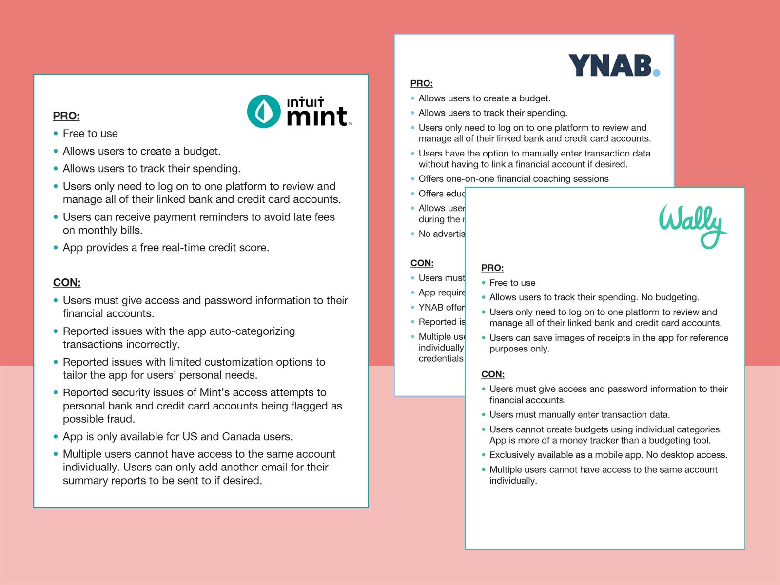
I then synthesized my research data to pinpoint the top concerns of my target users.
- "I want to eliminate debt, but I don’t know the best/fastest way to achieve that."
- "I want to help my partner manage our joint finances but I don’t see an easy way to collaborate together."
This knowledge reinforced my decision to focus on a solution that provides educational and collaborative resources to empower these users.
Definition
I created a user persona to define a clear representation of my target user based on my research data.
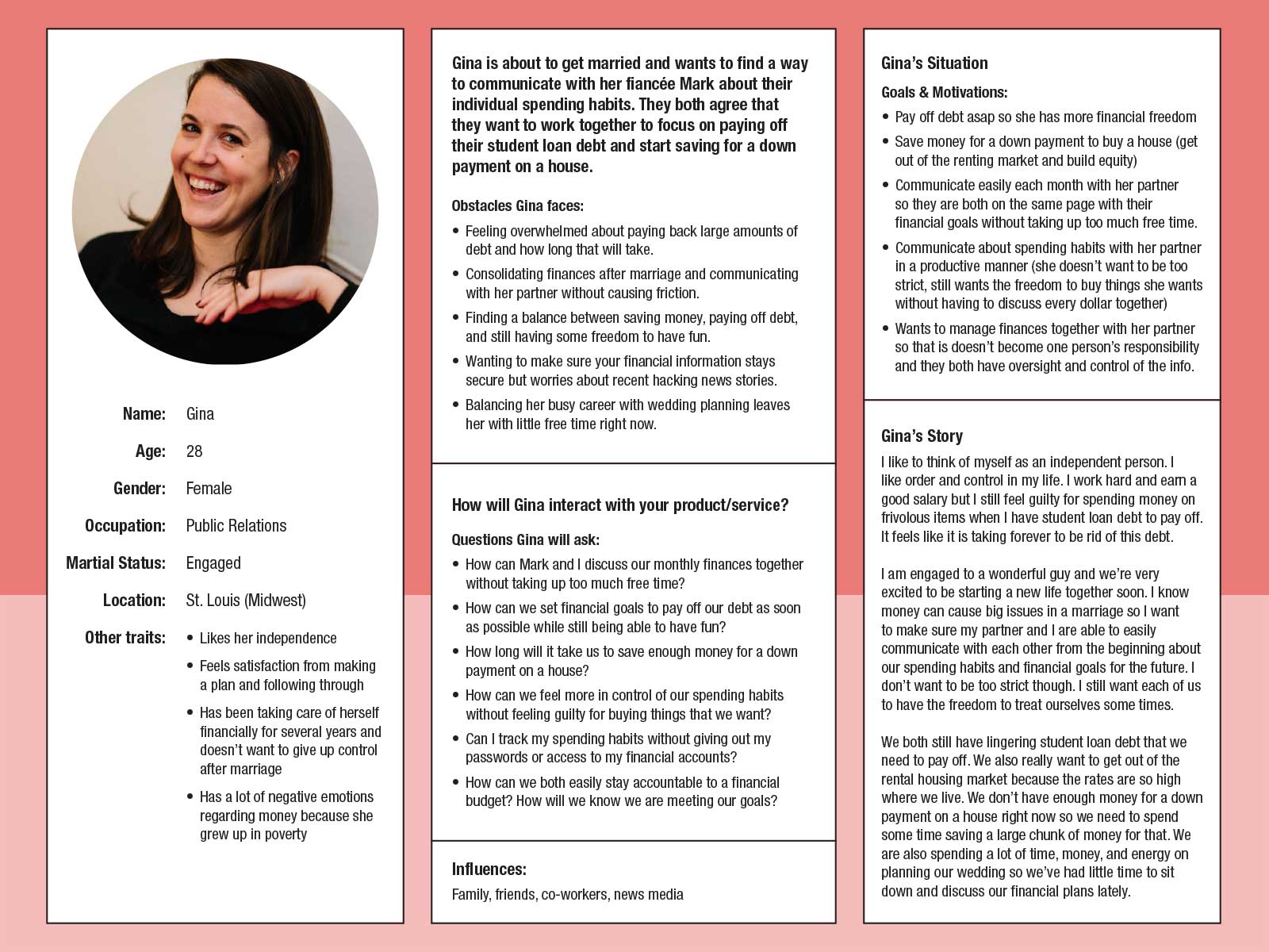
Gina’s top needs for using a tool to help her reach her financial goals include: a) Ability to use on-the-go, b) Reassurance that her financial/personal data is secure, and c) Ability to customize the tool to work for her specific goals.
I then created a customer journey map to empathize with what my target user thinks, feels, and struggles with during a financial planning task. I uncovered key insights:
- Users value accuracy over convenience. They don’t want to spend excess time on manual data entry but find it frustrating to go back and correct errors on data that was auto-generated for them.
- Users want to see where their efforts will take them. How does doing Task A over a period of time get me to Goal B?
- Ignorance is contributing to the fear and uncertainty surrounding financial security. It is easy to become overwhelmed by all the data and unclear paths to take.
- Budgets can be time-consuming to set up.
- Budgets can feel restrictive which leads users to easily give up on them.
This knowledge reinforced my decision to focus on a solution that provides educational and collaborative resources to empower these users.
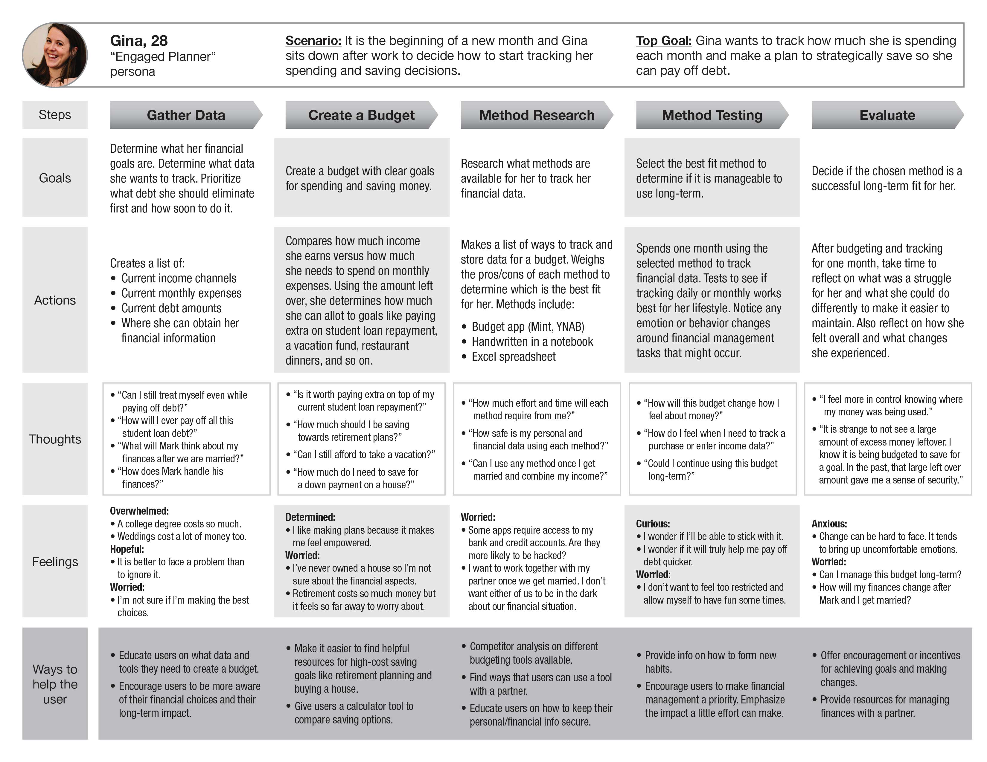
Gina’s journey map highlights her concerns around paying off student loan debt, how to effectively manage her finances to reach her goals, and how to handle combining her expenses after marriage.
My problem statement formed in to – “How might we manage financial data (user action) so that we feel empowered and hopeful about our current/future financial outlook (user benefit)?” The solution’s goal would be: “To help users manage their finances so they feel empowered and able to achieve financial stability.” This gave me criteria to brainstorm and evaluate possible design solutions against.
Ideation
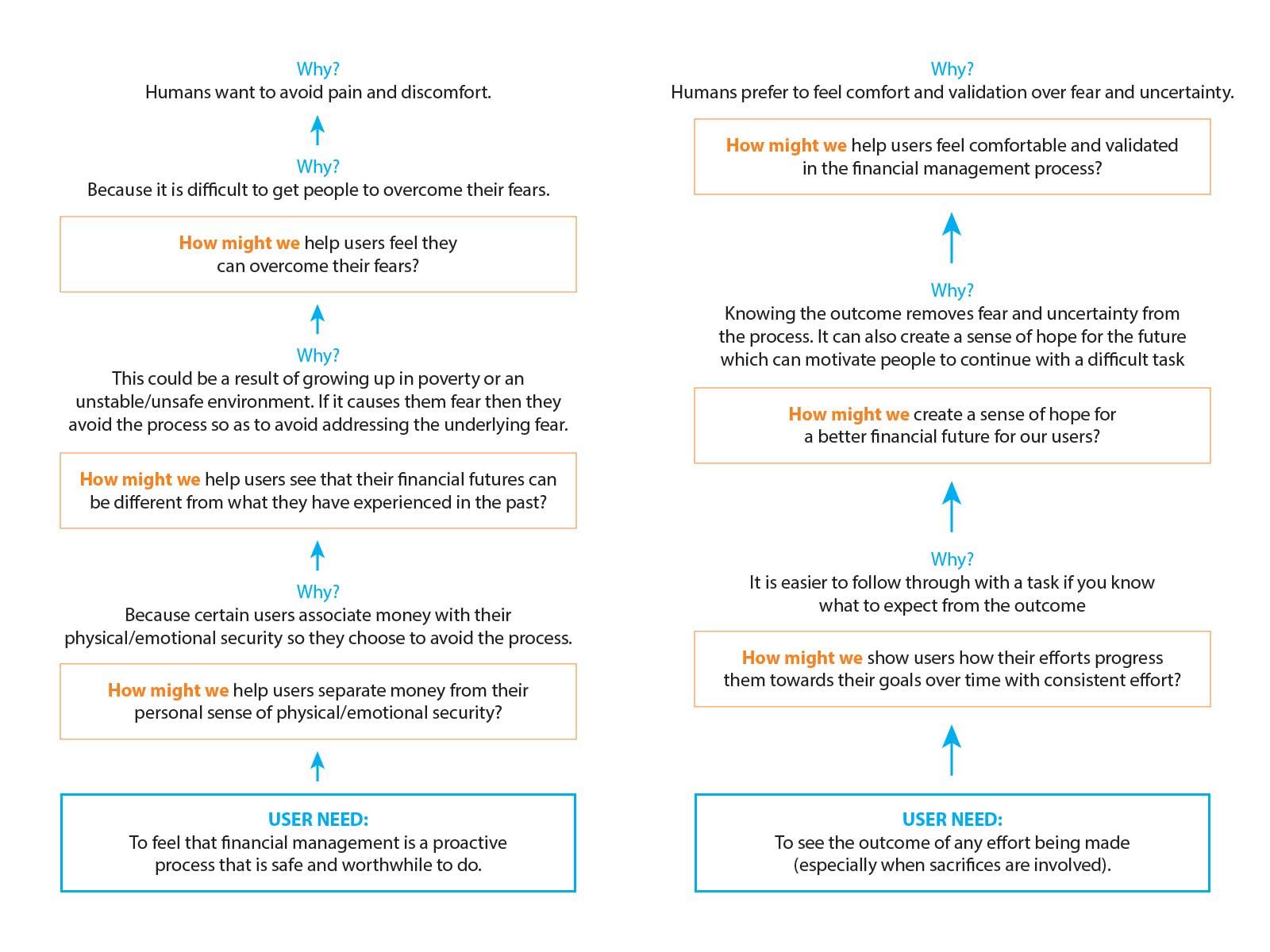
I took the key insights from the persona and journey map analysis and used the Why-How Ladder method to begin brainstorming solution ideas. This method helped me to uncover the deeper, root causes of each user need/concern that should be addressed.
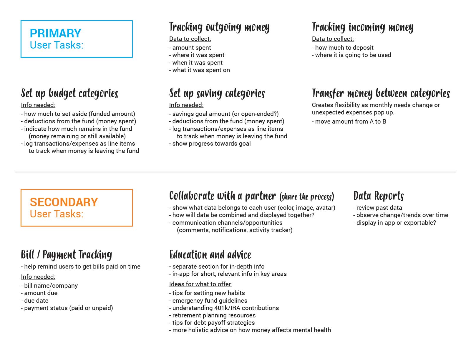
I also performed some task flow analyses to determine what tasks the user would want a tool to help them accomplish. Determining primary versus secondary tasks helped me to establish the most helpful hierarchy to the interface design.
Key design decisions made:
- I chose to design a mobile app instead of a responsive website.
- The user will need to allocate all money into spending and saving budget categories upon deposit into the account.
- There will be an option for a user to link their account with another user’s account with consent.
Prototype & Evaluation
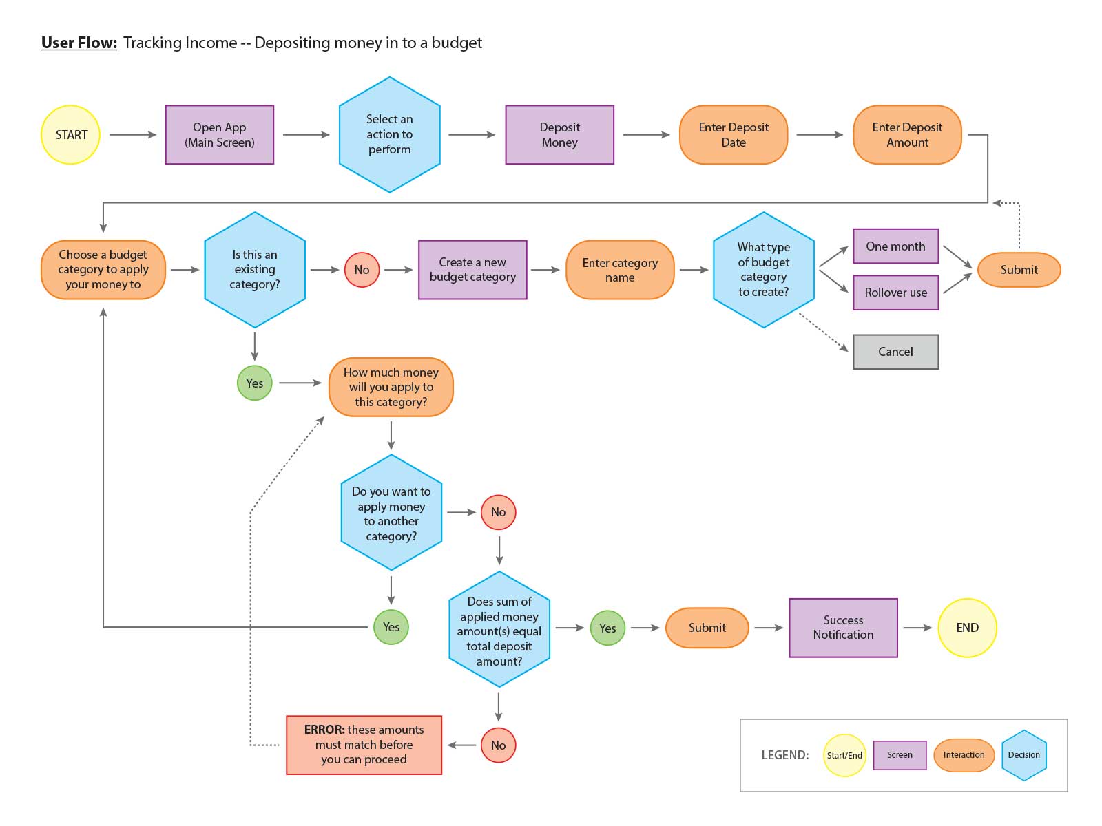
Once decisions were made to guide design parameters, I performed several user flows to examine how a user would approach using the app to accomplish tasks.
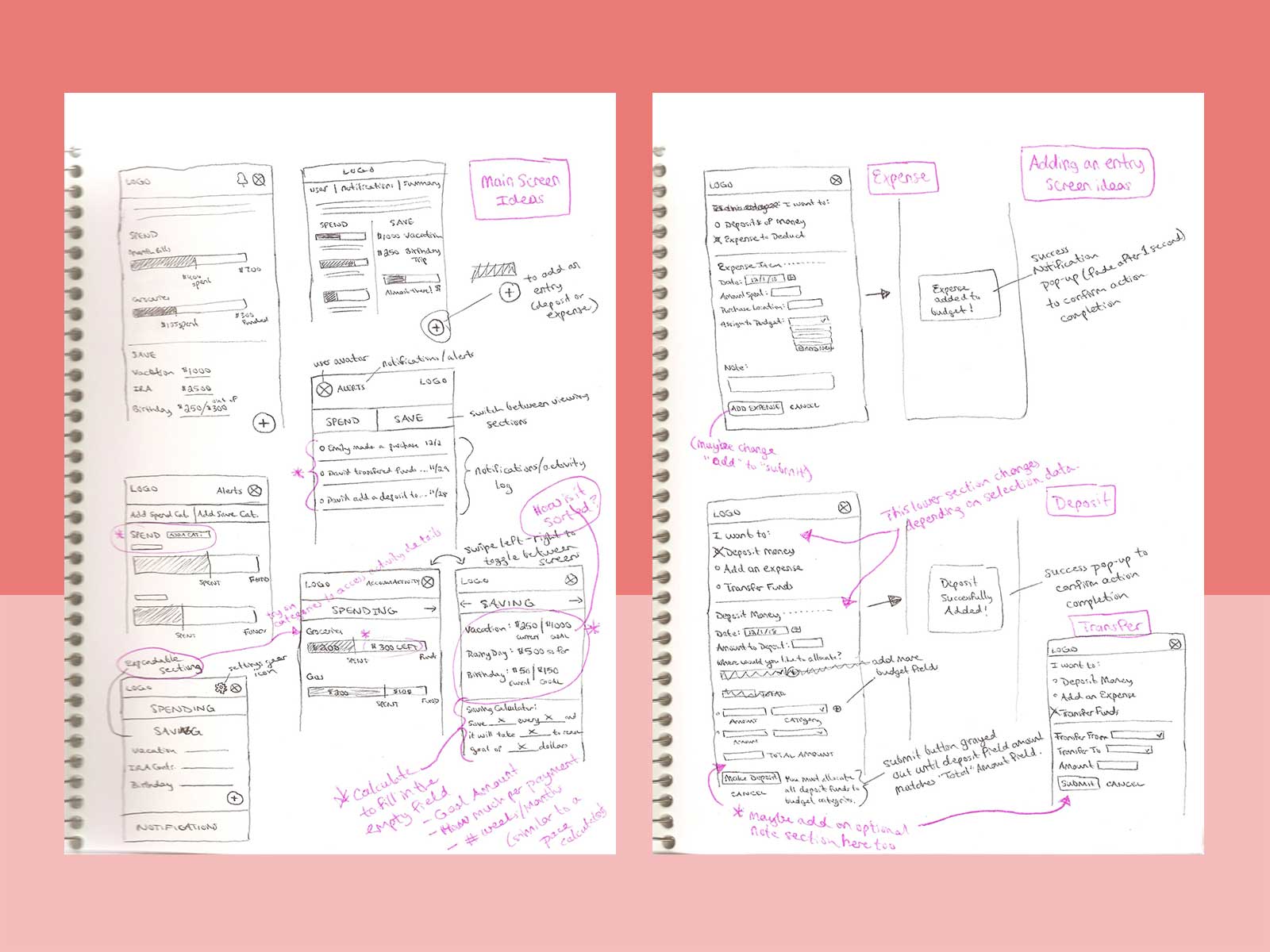
Then I sketched layout options on paper. I wanted to quickly express and iterate through these early design options before investing time and effort on digital mock-ups.
Taking inspiration from each paper sketch, I created low-fidelity wireframes using Figma. This gave me a digital skeleton that I could build and iterate upon.
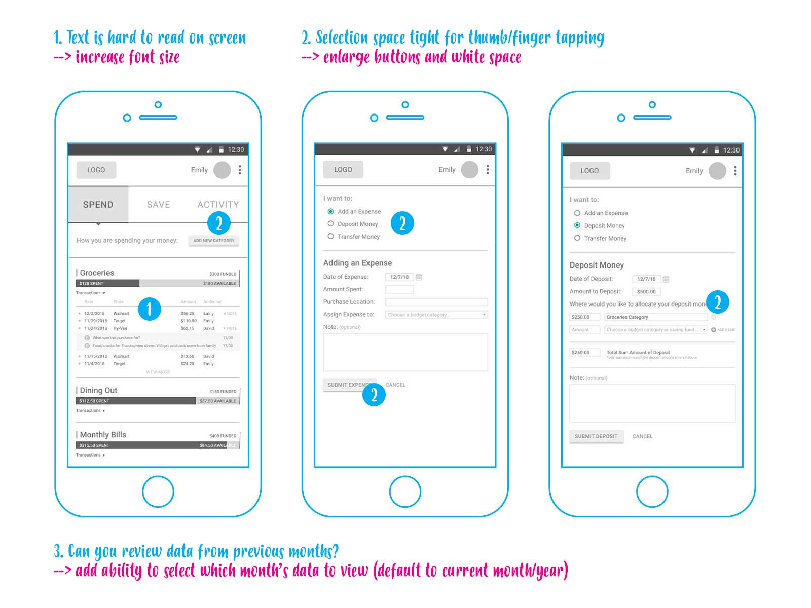
I conducted a usability test on my low-fidelity wireframes with two target users. This uncovered minor visual issues (shown above) that needed to be adjusted – user preference for a larger font size and certain button size/placement. It also uncovered minor functionality gaps:
- There was interest for an option to create privacy when sharing the tool with a partner.
- There was interest in seeing a real-time tally of how much they spent throughout each month so they could compare it against how much income they were depositing.
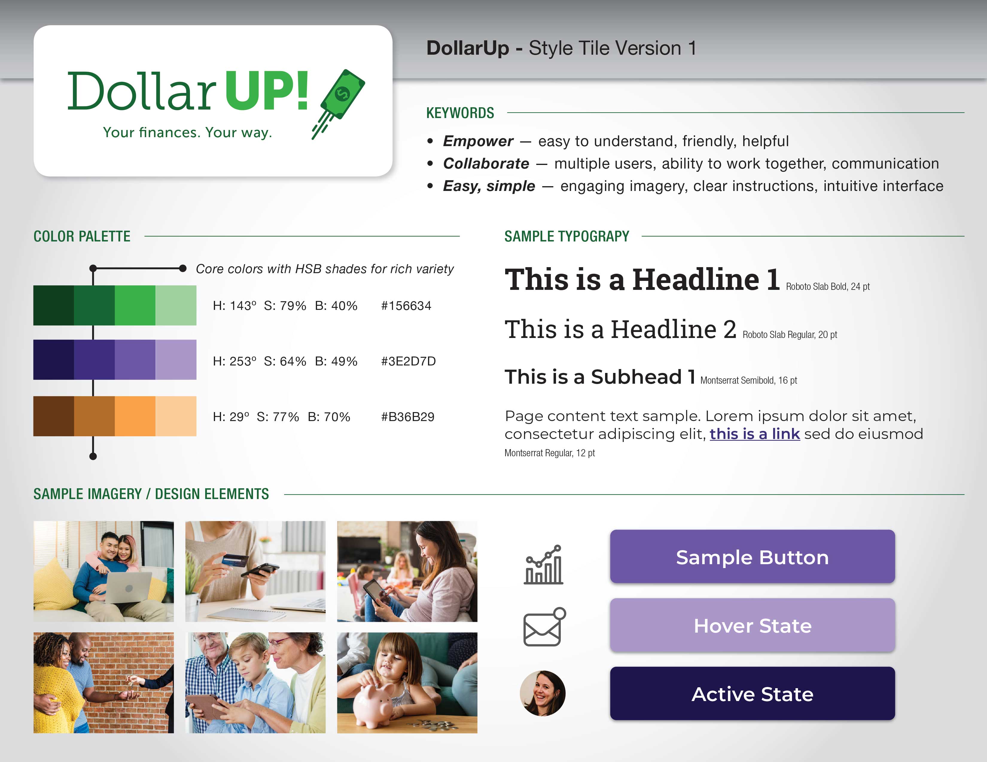
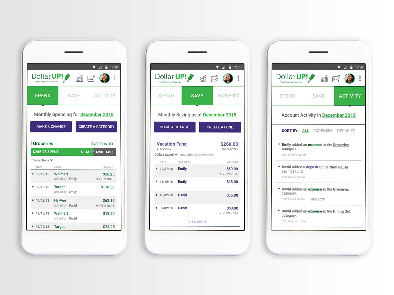
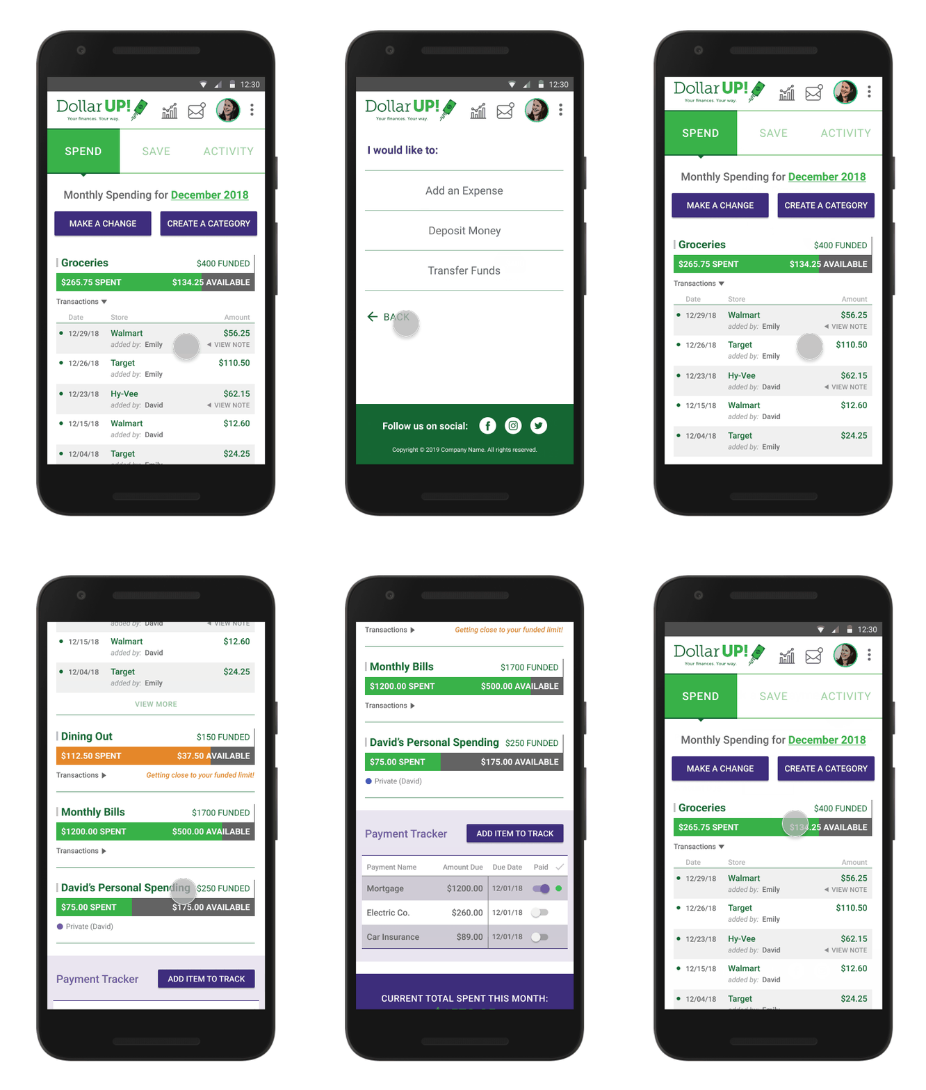
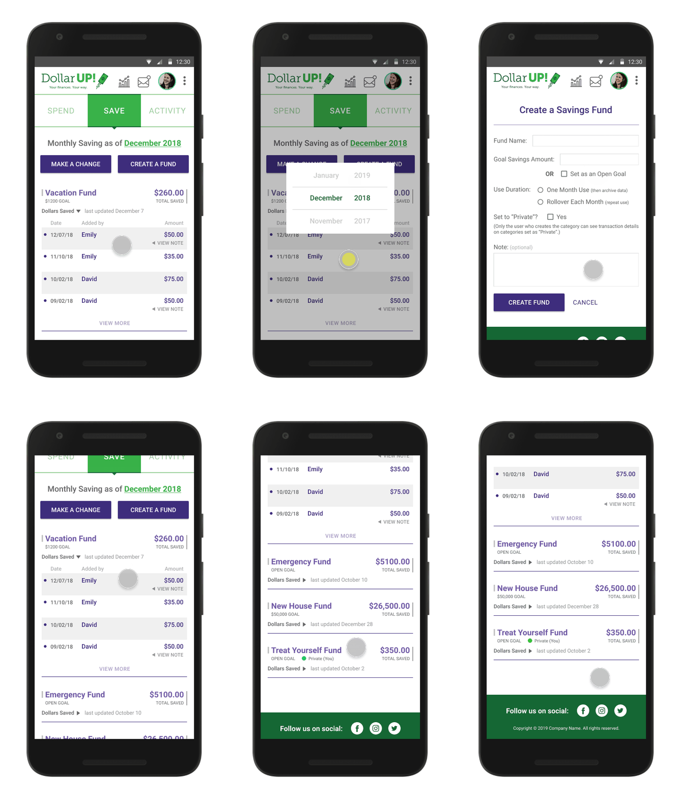
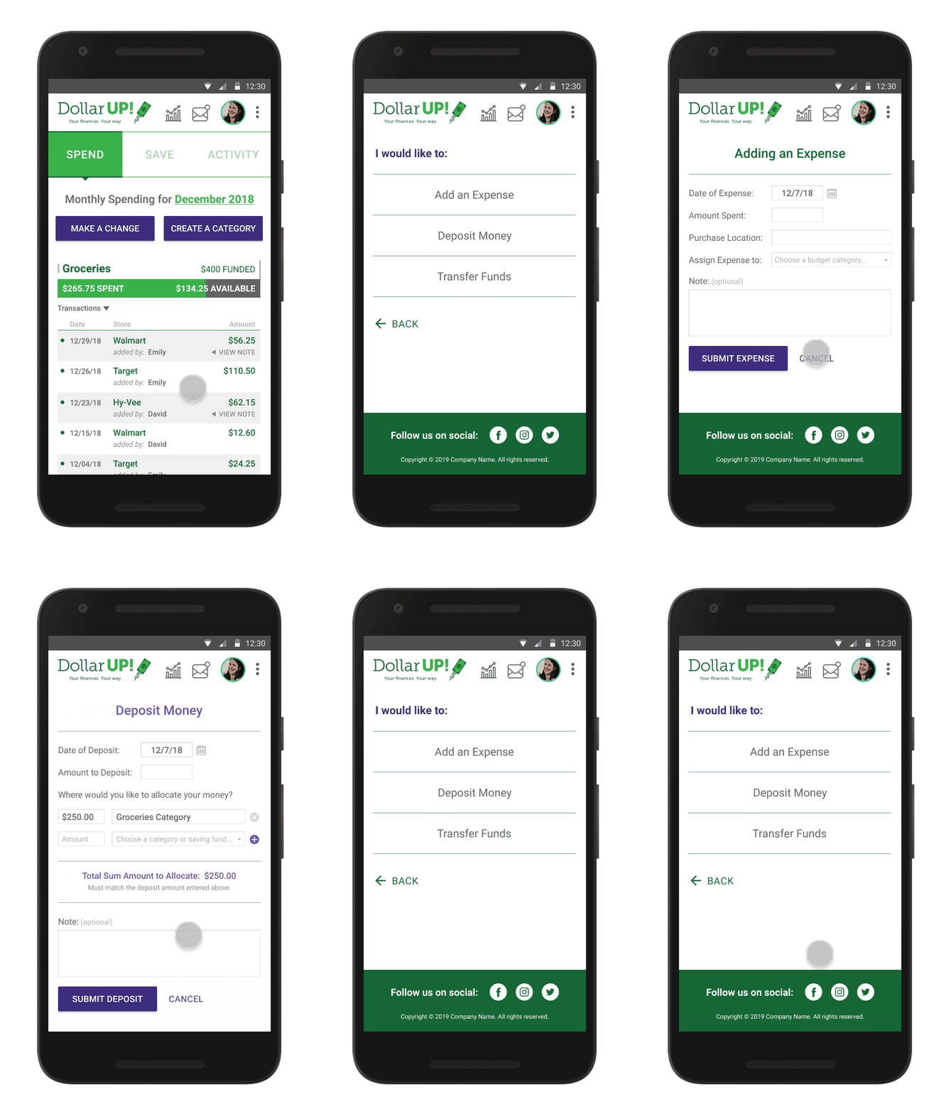
After addressing these concerns, I moved on to visual design. I created a visual style tile to represent the brand’s look and feel so I could translate it to the interface component designs. Then I created the polished high-fidelity mock-up that would be ready for final approval and development.
Conclusion
Summary
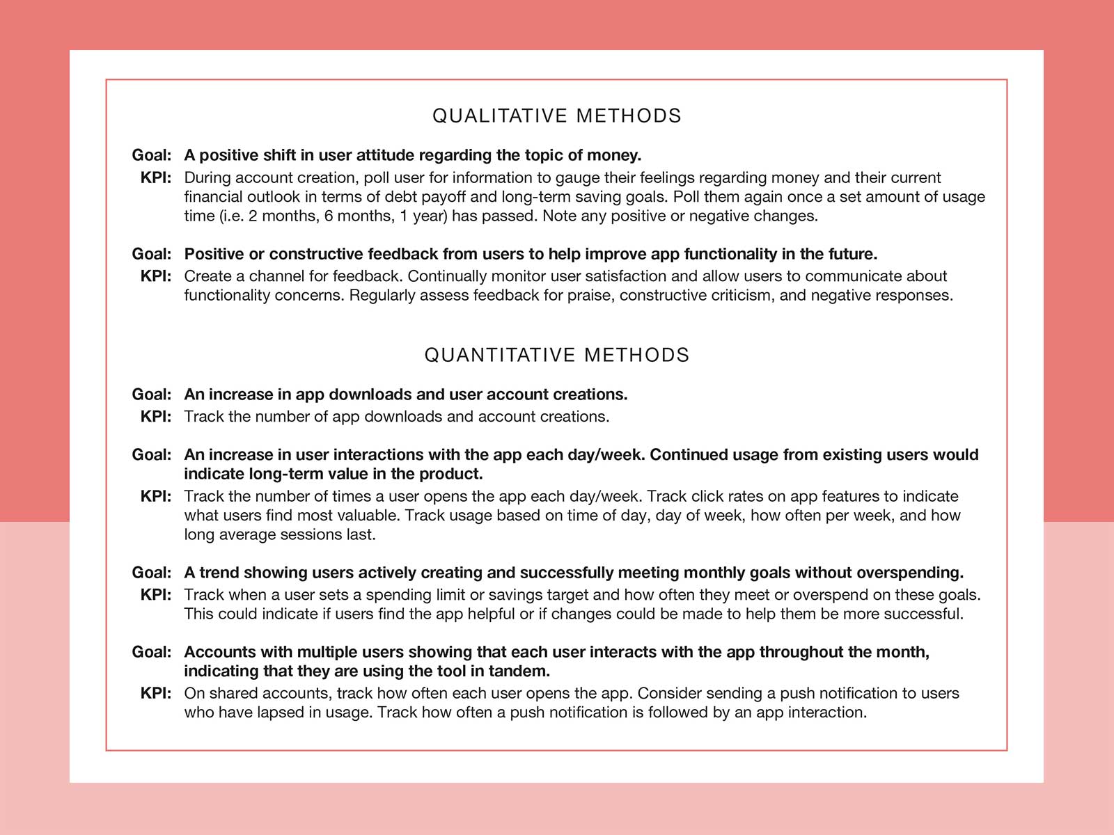
DollarUp is a financial management prototype app that I designed as part of my self-driven Interaction Design Foundation course work. There are no current plans for development. However, if developed, I would track the following Key Performance Indicators to measure the product’s success:
Reflections
If more time and resources were available for this project, I would like to spend time talking with users of the competitor budget apps. It would be insightful to gain first-hand understanding of their experiences and struggles. I would also like to speak with other age groups of potential users. There are many different financial stages in life to explore and understand.
If DollarUp moves forward into development, it is my hope to expand the product through educational content for everyday people. Since there is a lack of public school education on the topic, it could be a profitable means to help users better understand credit and lending practices, long-term saving and investments, and strategies for planning for big life events such as college funds and retirement.